
DIZZY: Market Charts Show Real Estate’s Extreme Altitude

Published On: July 11, 2016 Posted by: Jeremy Peterson
The real estate market has been on an unprecedented run this year. A surging local job market combined with limited inventory has pushed all of the normal market dynamics to extreme territory. Buyers know this as homes they pursue are snatched up before they can even submit an offer. Sellers know this because they are smiling all the way to the bank. The anecdotes are compelling but the charts really tell the story. Lets take a look at a few:
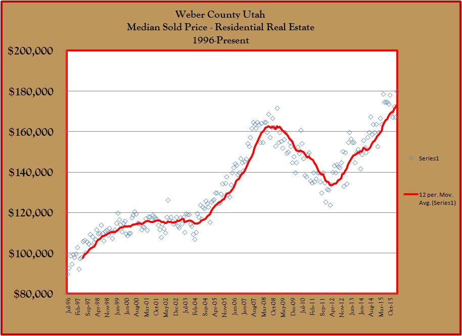
First, lets take a look at what residential real estate values are doing. This chart above shows median sales prices for all residential real estate in Weber County and the moving trend. You can clearly see the recessionary plateau in 2001-2004, the bubble of 2006-2008, the crash of 2009-2012, and the subsequent market run that has surpassed the highs of the previous bubble. If you purchased real estate in the crash, you are loving life right now. Here is another chart zooming in on the latest run:
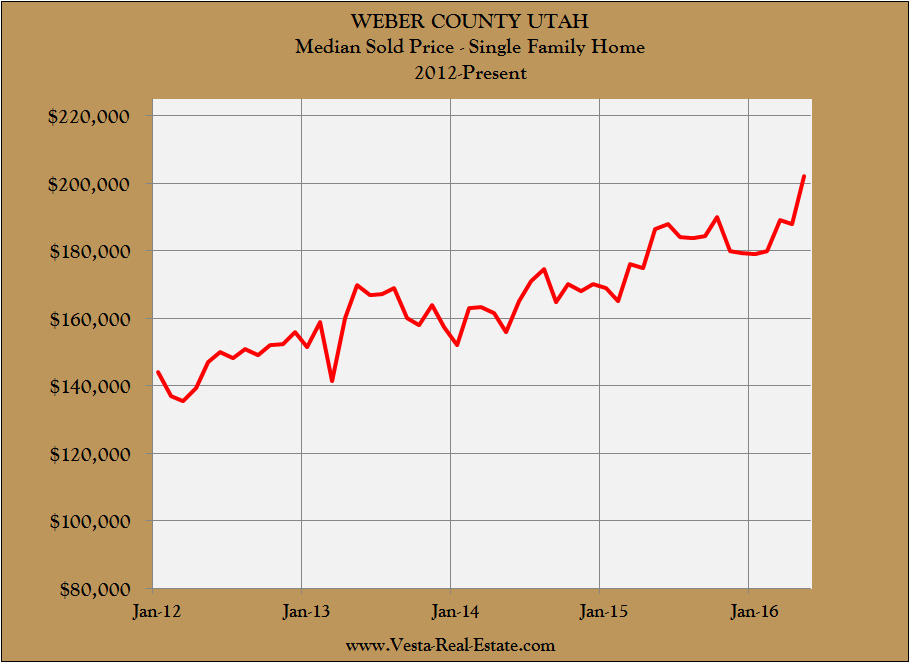
That chart varies from the first chart in that this is not a trendline. Instead, these are the monthly data points. Starting in 2012, you can see that house prices have increased consistently for the past four years. So are we in a new bubble? To find out, lets take a look at inflation adjusted house prices.
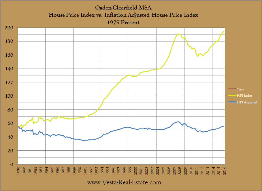
The yellow line follows our first chart above. The blue line represents inflation adjusted house prices. Unless other forces are at work, you would expect to see this trend perfectly sideways as house prices track with inflation. However, as you can see, there definitely are other forces at work and these variances tell us a lot. Let’s zoom in on the inflation adjustment and see if we can identify some trends:
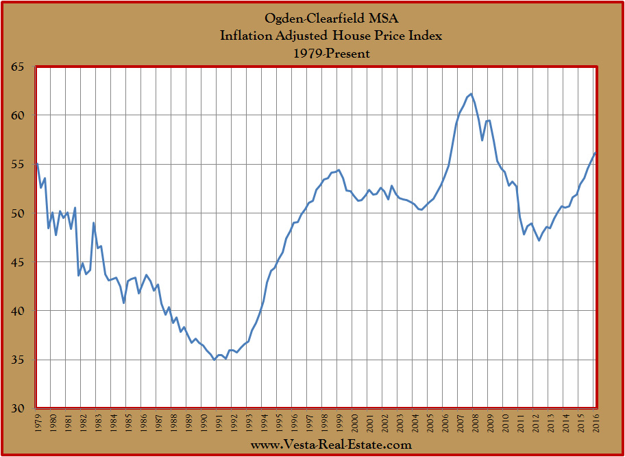
Here is our inflation adjusted line zoomed in for greater precision. This line tells the story of real estate in Weber County. From 1979 to 1991, Utah was in a real estate recession. House prices were not keeping up with inflation for over 12 years. Then in 1991 house prices sling shot upward as they caught up to all that missed inflation. That market run ended in 1999 with a blow off top. Real House prices declined slightly as the recession of 2001 began. The low ebb of inflation adjusted values in that cycle was in late 2004, just as I was getting into the real estate business. Then, the bubble is obvious as it spikes upward and reaches heights not seen elsewhere in our 40 year history. After that, the crash made real estate the best bargain since 1994. Our current run is now looking eerily like a bubble.
Yet, unlike the bubble years, house prices today (both real and nominal) are founded on jobs, income, and good credit. These three pillars of sound lending were absent during those crazy bubble years. So, prices today have a foundation underneath them. The question, then, is how good is that foundation?
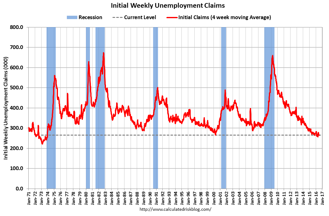
House prices are based on wages. Wages are highest when unemployment is at its lowest. The above chart shows us that we are at cycle lows when it comes to unemployment claims. It is possible that these figures stay this low for a while, but for how long?
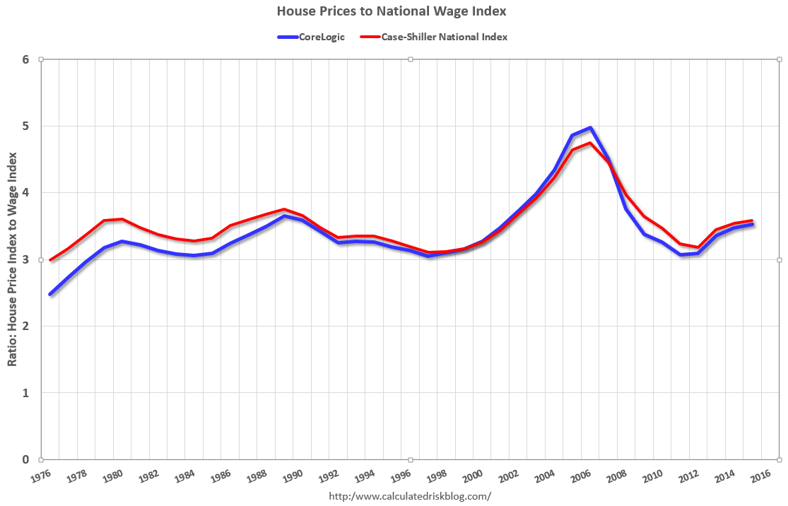
Besides inflation, we can look at house prices another way. Buyers are typically willing to spend a certain percentage of their income on housing. Their willingness to spend dictates how how high house prices are relative to a their overall income. The above chart shows us the relationship between house prices and buyer’s wages. On a nationwide historical basis, a home has been somewhere between 3.0 to 3.7 times the annual income of the purchaser. For example, if you make $50,000 as a household, historically you will likely purchase a home that is between $150,000 and $185,000 depending on where we are in the market cycle. The ebbs and flows of the chart show this cycle as the market shifts in favor of seller’s to buyer’s and back again. In essence, this chart is a measure of affordability. The latest reading on the chart is from mid 2015. What does it tell us about where we are in the market cycle? Here are some more charts to help us understand where we are at:
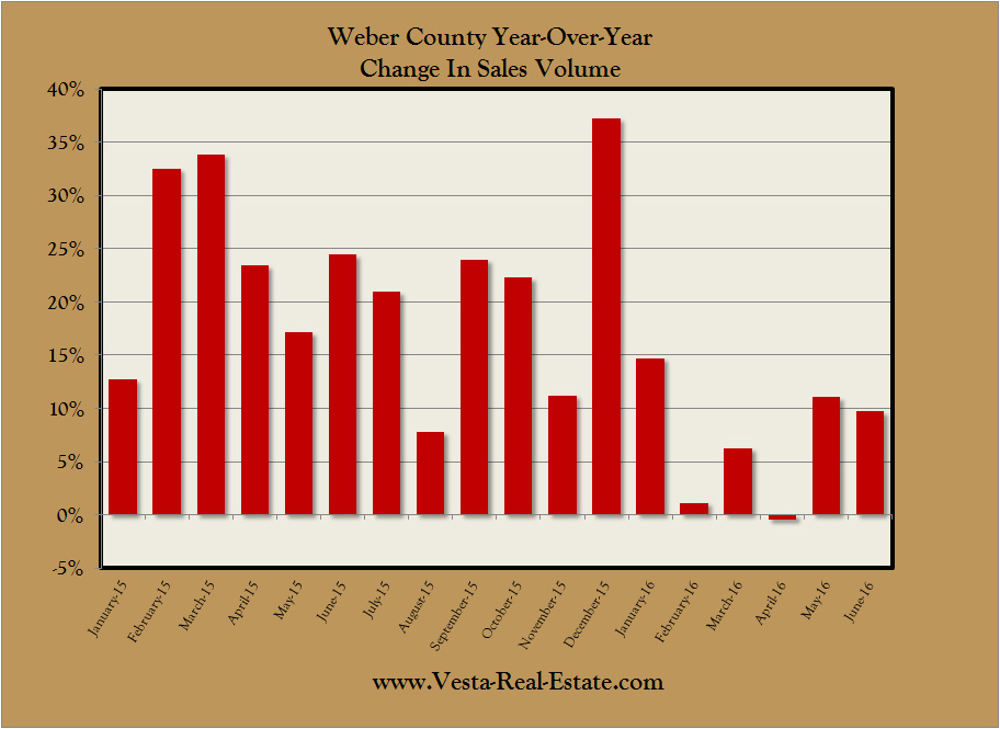
Locally, sales volumes have been steadily increasing since the market began to recover four years ago. However, this past year has seen increases begin to slow down. The giant spike in December was an outlier due to changes in lending laws. If we ignore that month, the days of 15%+ year over year sales growth seem to be over. If the current trend continues, sales growth will be flat by the first quarter of next year. Does this mean we are reaching our market zenith on sales volume?
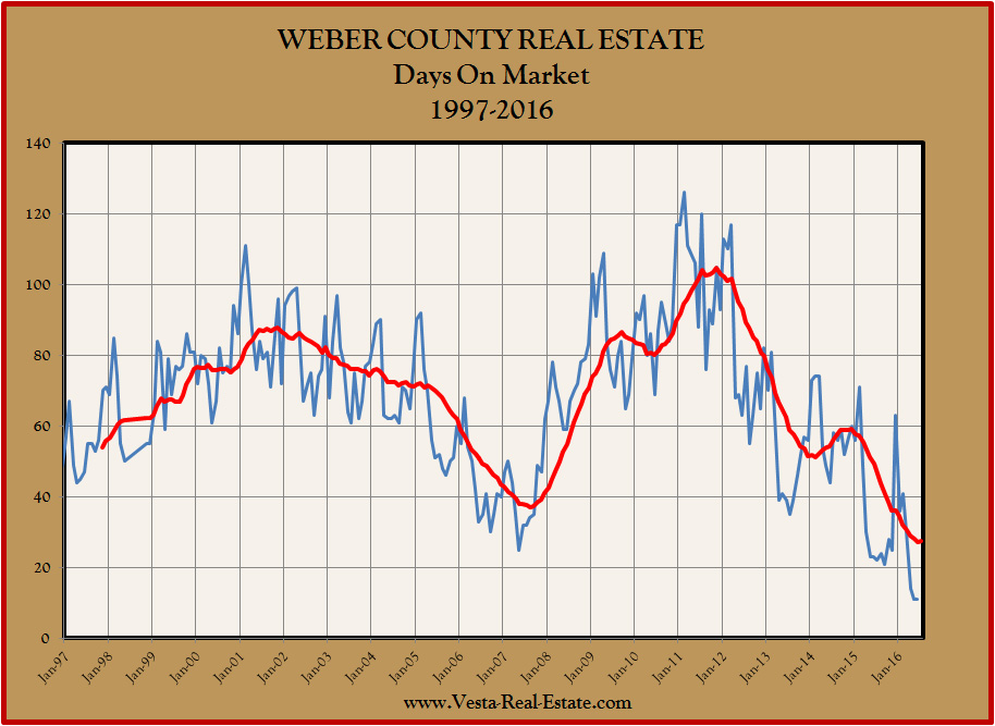
Finally, lets take a look at how long it takes to place a home under contract. The Utah MLS has been keeping track of “Days On Market” of listings sold since 1997. In buyer’s markets, the number is high and in seller’s markets the number is low. For the past two months, the number has come in at a record low 11 days. How low can it go? And for how long? My hunch is that this summer may be the last hurrah for super short sales for this market cycle.
The bottom line is that the real estate market operates like the tides of the ocean. The only difference is that we can predict the high and low tides with exact precision. Markets are a little more fickle. Even so, we should be aware of the signs that a change in market tide is coming. Hopefully these charts will shed some light on where we are, and what may be coming.