
MARKET TRENDS: Fork in the Road?
Published On: November 17, 2017 Posted by: Jeremy Peterson
As the year wraps up, it is apparent that 2017 has been a banner year for real estate values. Prices have surged 15.5% in Weber County. Sales times reached record lows over the summer. And buyers continue to outnumber sellers and create bidding wars at every turn.
Yet, it feels like there is a change coming in the market. Interpreting the signals is proving to be a little harder than in the past. I will explain why. But first, here are the charts.
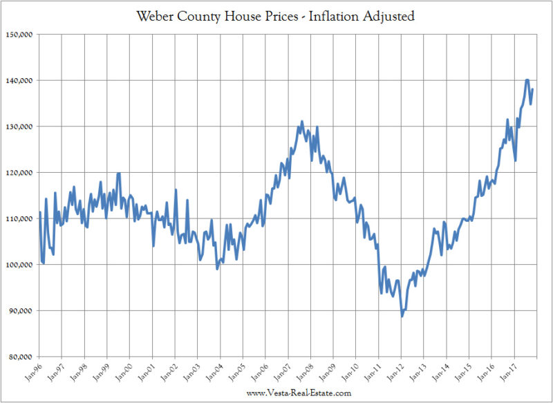
First, here is our inflation adjusted house price chart for Weber County. To get this chart we took the median $/sqft of homes sold, multiplied that by 2000 SQFT to get a price for a home of that size, then adjusted it based on the BLS CPI deflator. It’s wonky math but it provides us with some good insight.
What we see here is that house prices have exceeded their 2007 peak by large margins on a REAL BASIS. Given the excesses of the 2007 market, it would seem that red alarms should be going off about how extreme these values are presently. The major difference this time though is that prices are based on supply/demand principles, good underwriting on loans, and everyone getting a loan has a job. The foundation on loans is solid and there is a persistent undersupply of housing.
Another chart worth looking at relates to mortgage payments. Since homebuyers purchase homes based on what they can afford on a monthly basis, knowing what direction payments are headed is important. Understanding the inflation adjusted payment also helps us put things into perspective over time.

Do get this chart, we took our 2000 SQFT median home value, translated that amount into a 30-year mortgage balance and then calculated the payment on that mortgage using prevailing interest rates. We then deflated that number using our BLS CPI figure. What we see here doesn’t look like much but it provides us with some interesting findings.
First, notice the peaks in 1999 and 2007. Those peaks coincided with the top of the housing market in the two previous cycles. Yet since 2013, payments have limped along and seem to be eeking upward ever so slowly. With things feeling like a market top on house prices, what is going on here? Are we at a top?
Let’s queue our mortgage rate chart to see what is going on:
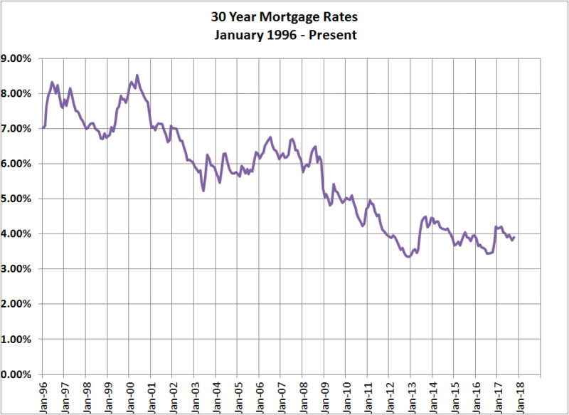
In the two previous market tops of 1999 and 2007, the peaks coincided with a relative spike in interest rates. That explains our peaks in the previous chart. Yet, today, interest rates are at historic lows and have been there for some time. This explains why our mortgage payments chart has failed to catch up to the peaks of previous cycles. In fact, in order to catch up to our 2007 payment peak, house prices today would need to increase another 23% at current interest rates!
Also consider that the monthly payments being made during the 2006-2008 time frame were not really 30-year amortized mortgages. Payments were less than this due to interest-only and other exotic loan terms available at the time. But, the chart still shows us how price and interest rates affect payments under similar terms.
The time between the two previous tops was 8.5 years. It has been over 10 years since the last top.
So, is Utah’s raging sellers market finally ready to take a pause? The fundamentals say no, yet history says yes. Time will tell.