
CHART: Hottest Seller’s Market…But For How Long?
Published On: December 2, 2015 Posted by: Jeremy Peterson
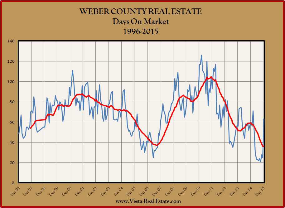
One of the market indicators that helps us track the real estate market cycle is “Days On Market” (aka DOM). This is a simple measurement that tells us how long a home is marketed for sale before an offer is accepted on the property. It marks the time between the home being officially put up for sale and the seller signing a purchased contract with a buyer.
As such, it is a measure of demand and tells us how “hot” or “cold” the market is in any given moment. Here is a chart showing DOM for Weber County from 1996 to the present.
The blue line here represent the month to month figure while the red line represents a a 12-month moving average. As you can see, the blue line varies based on the yearly seasonal cycle. The red line helps us see through that choppiness to get a better feel of market direction.
What this chart tells us is pretty interesting. It appears that DOM is the lowest it has been since the haydays of 2007. Even more striking is that that most of 2015 has seen DOM lower than the lowest figures from 2007. DOM has reported at between 21 and 25 days most of this year. This is remarkable. This is the fastest homes have sold in 20 years! Typically 60 to 80 days would be considered a good market. Clearly, we are being spoiled right now.
What does this all mean? The bottom line is that the market is extremely strong. Inventory is very low and those homes that are ready to sell are being snatched up quickly. So what will 2016 look like? Do you see any pattern in the charts here? To me, it is hard to envision DOM going any lower than it has this year. It is also difficult to envision DOM sustaining this fever pitch for another year. We shall see.
In the meantime, if you need to sell your home, that market is in your favor. Give me a call and let’s make the sale of your home a quick one and at top market price.